2020
A Gourmet Sandwich Shop
The Proposal_
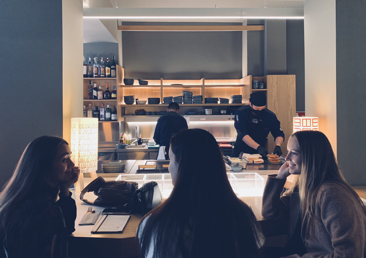
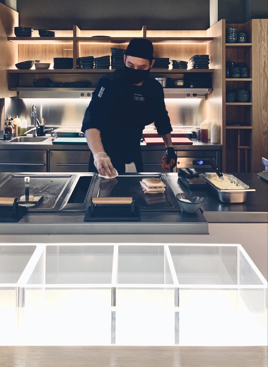
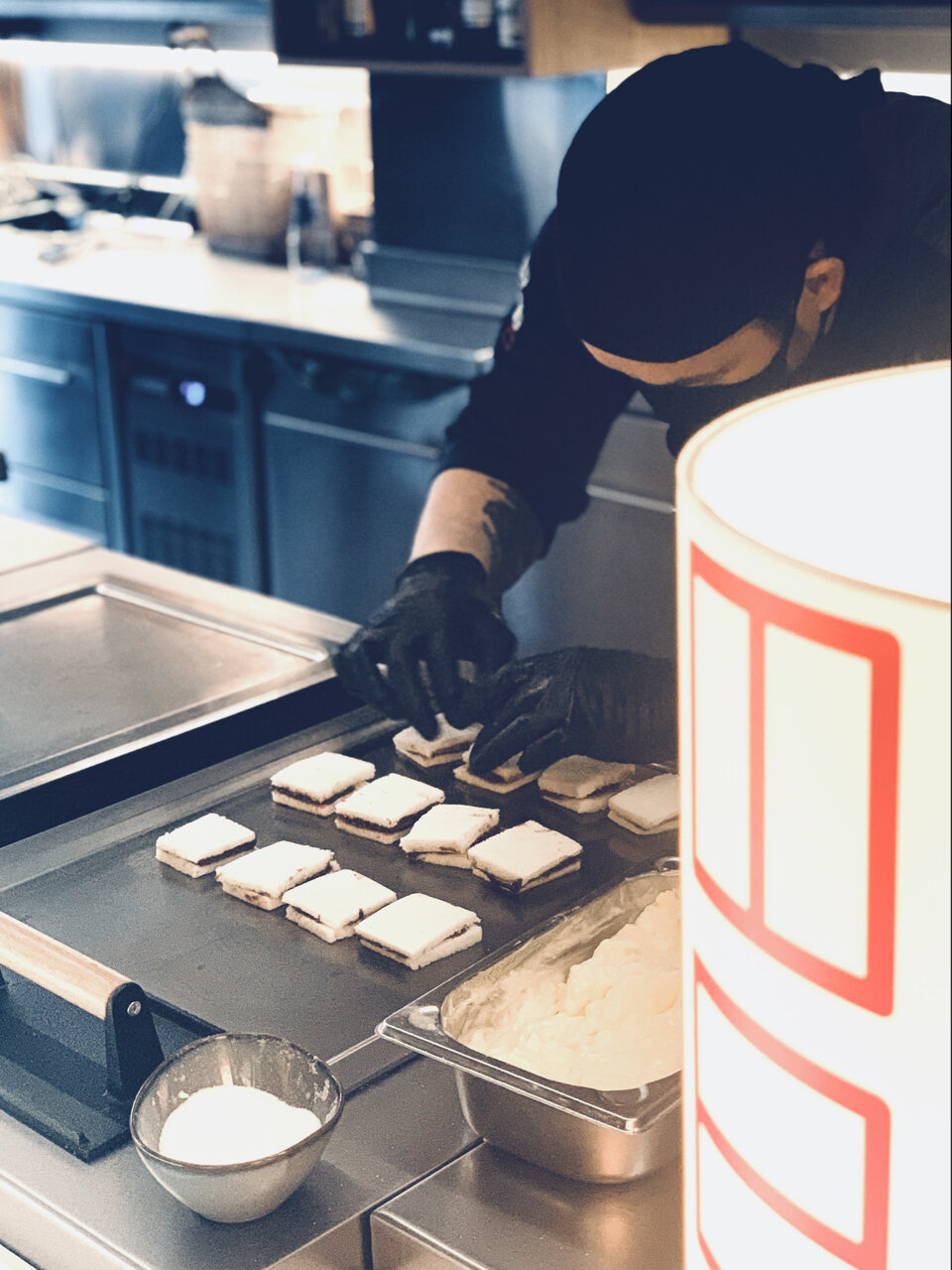
A Teppanyaki For Sandwiches
The project’s idea is to value a product that is not as distinctive as a sandwich, so generalized and so careless in most cases. The cook does not prepare the order hiding from the customer, but shows all the preparation, and the respective raw material, associating the experience with the traditional Japanese technique.
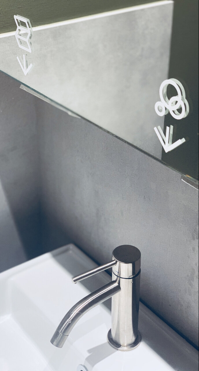
The corporate image* also intentionally seeks to generate uncertainty about the product type. The doubt upon entering becomes an anecdote to explain. *Collaboration with Antonio Morales (graphic designer)
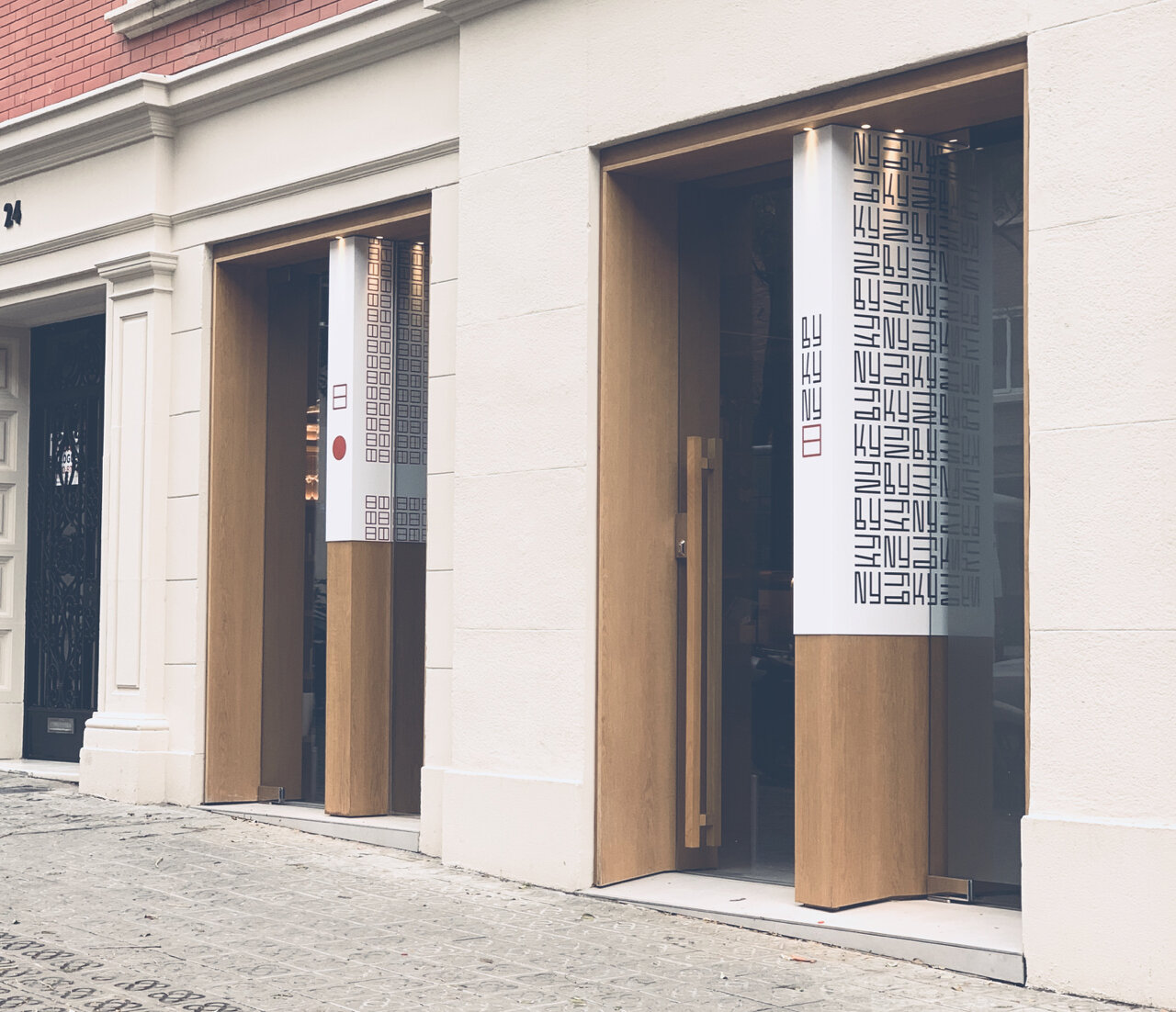
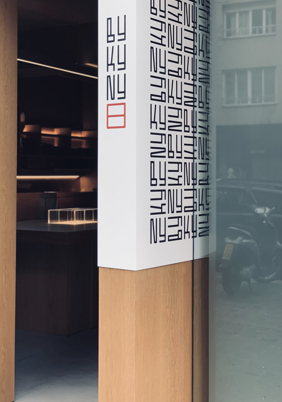
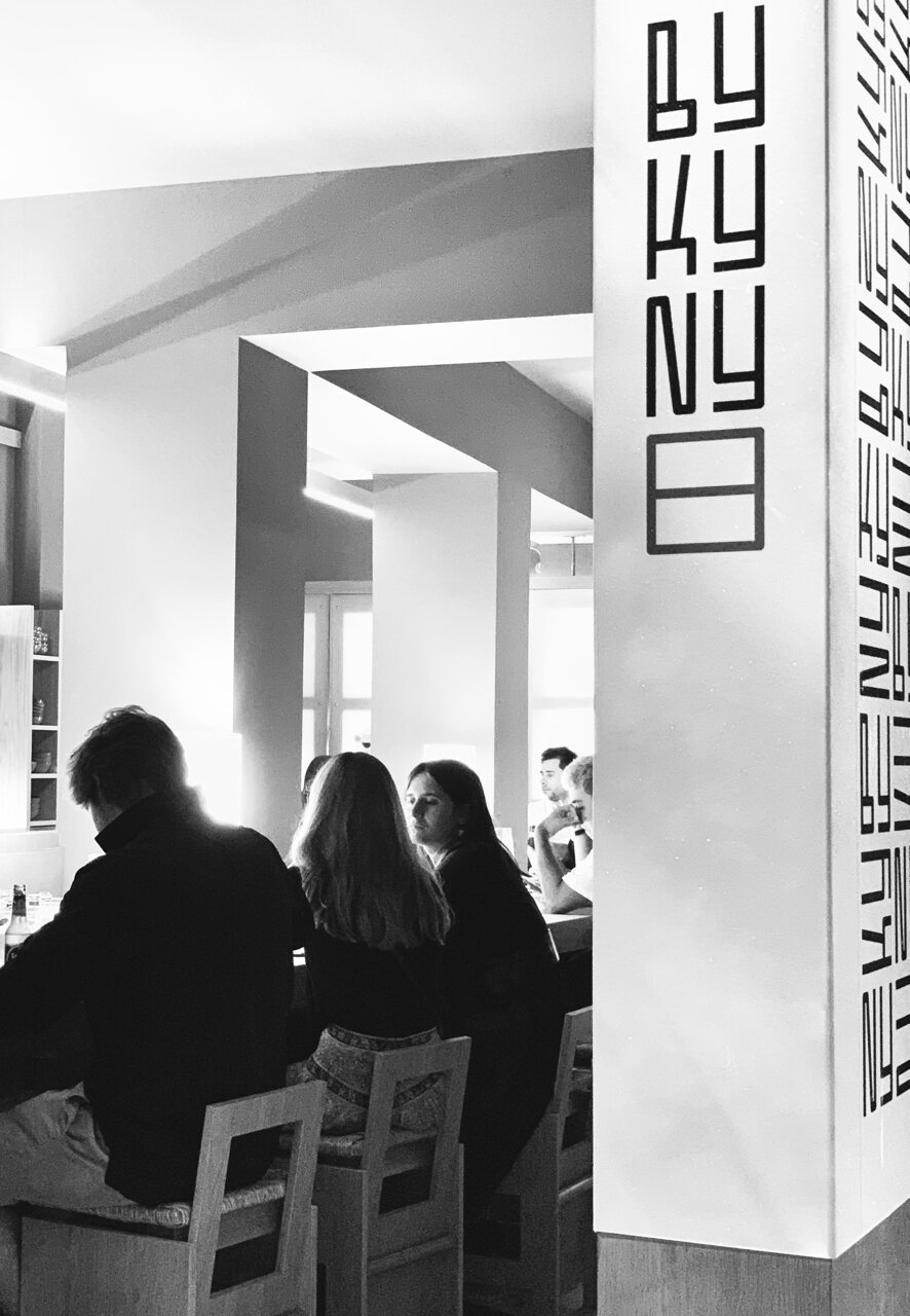
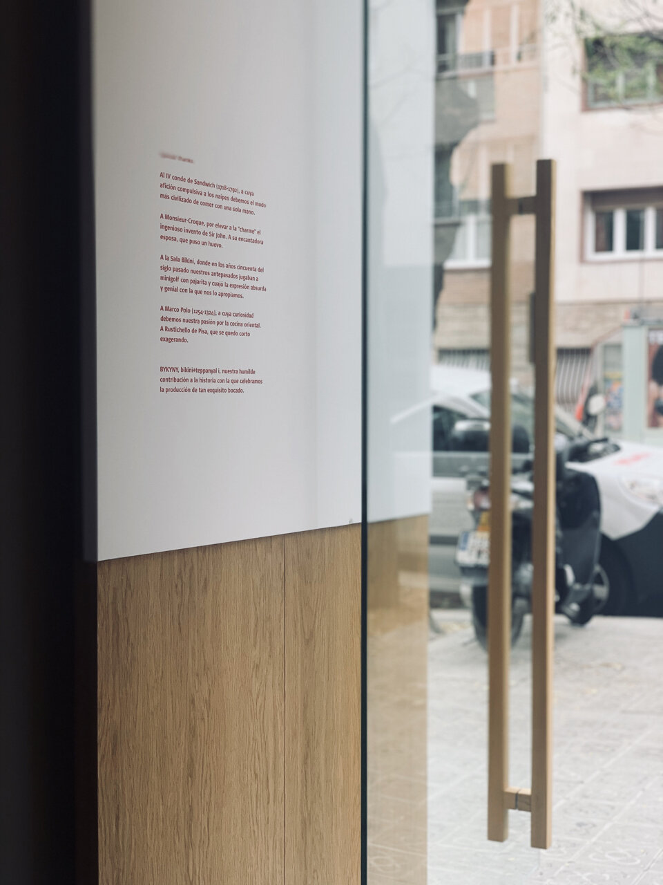
The Facade
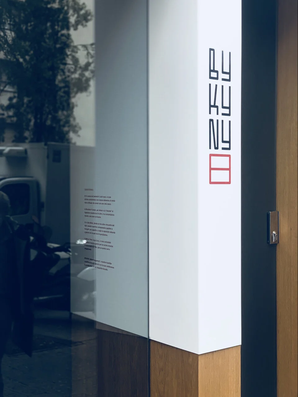
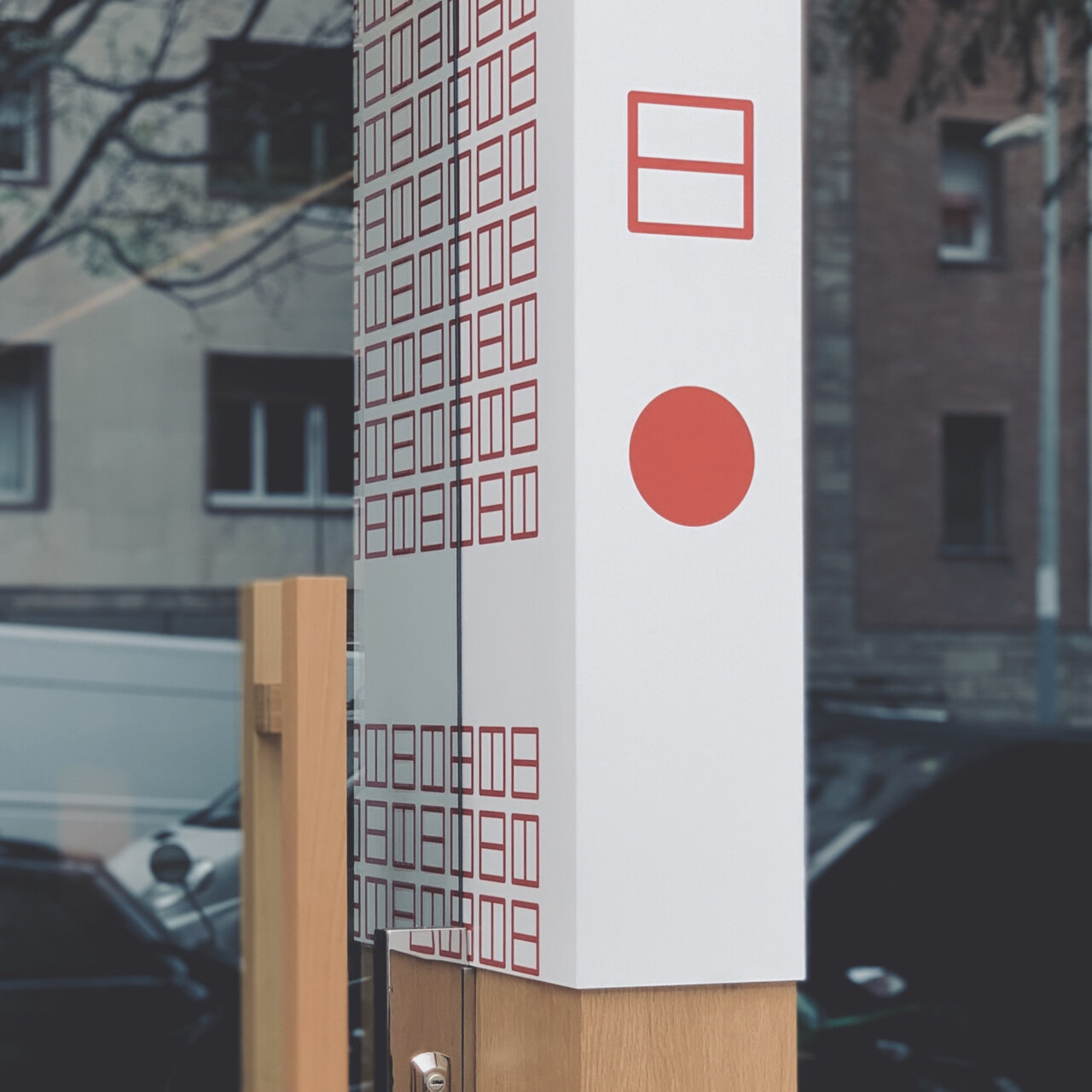
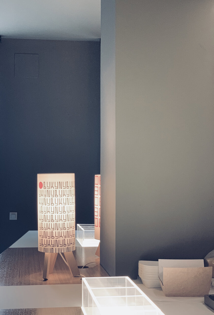
One of the facade ideograms (the red dot and the divided square) is an evolution of the Sun symbol in the Kanji script, instead, for BYKYNY represent the wine cup and the sandwich.
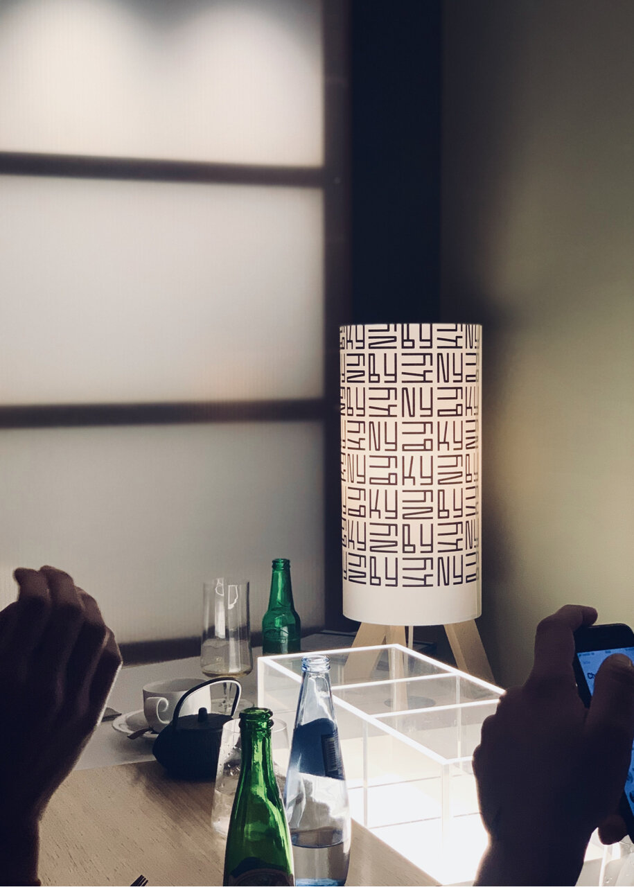
The idea of using the graphic image as a printed fabric was also applied in part to the sing, and to the lamps inside.
The signs are made with vertical structures that serve to organize both premises entrances, one for the staff and the other for the clients, where the sandwich shop’s statement of intentions text is included.
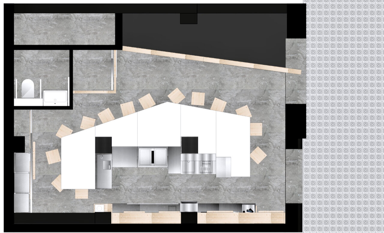
The Teppanyaki Table
In terms of layout, it was necessary to solve a problem of very limited space, invaded by two thick pillars in its center. The idea of a no complexes large table, located in the middle of the premises, compacts most of the uses and solves the logistical problem of its size.
This solution allows, among other things, the concentric circulation of the staff and the provision of storage spaces under it and also under the stools, these designed as open chests to store customer belongings (bags, motorcycle helmets or coats).
The Teppanyaki Table
The project’s idea is to value a product that is not as distinctive as a sandwich, so generalized and so careless in most cases. The cook does not prepare the order hiding from the customer, but shows all the preparation, and the respective raw material, associating the experience with the traditional Japanese technique.
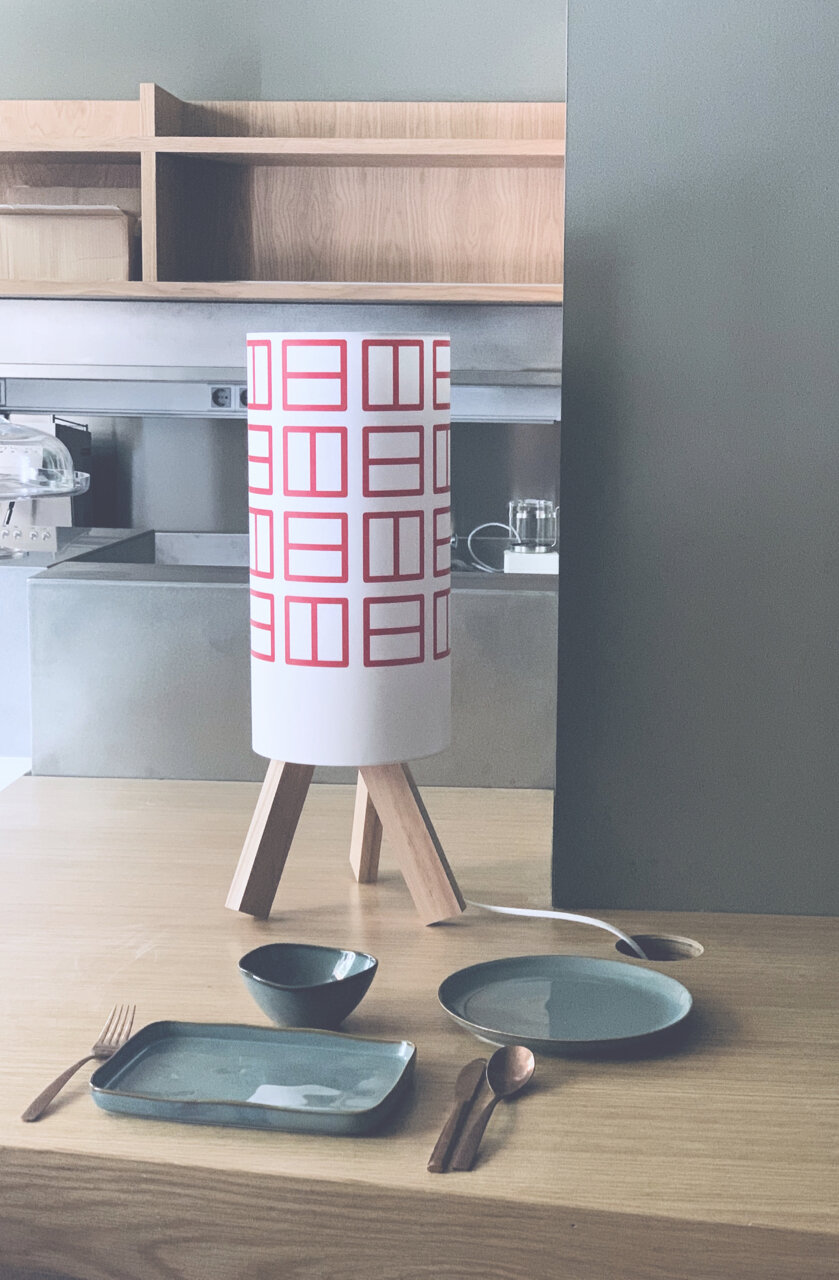
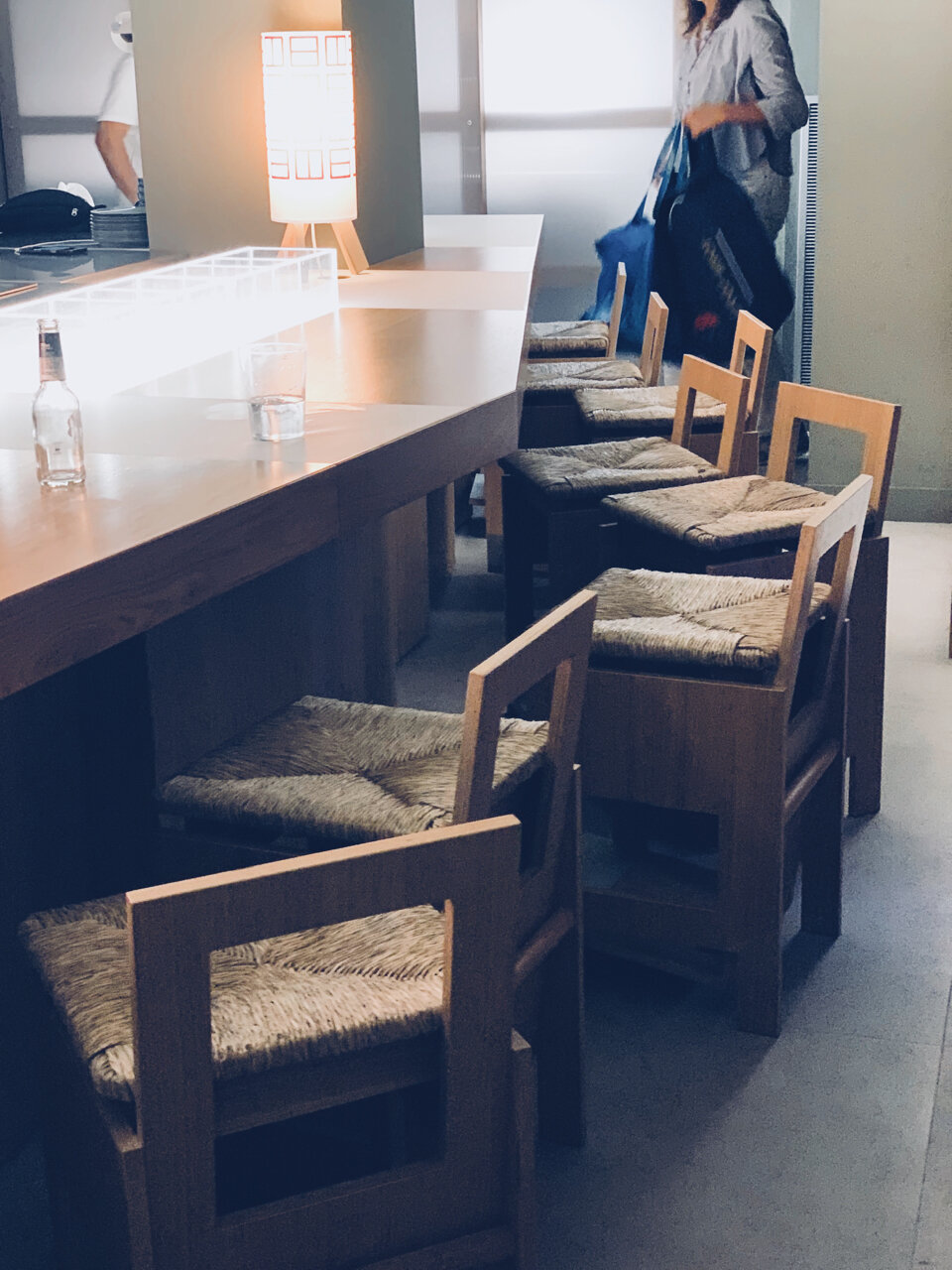
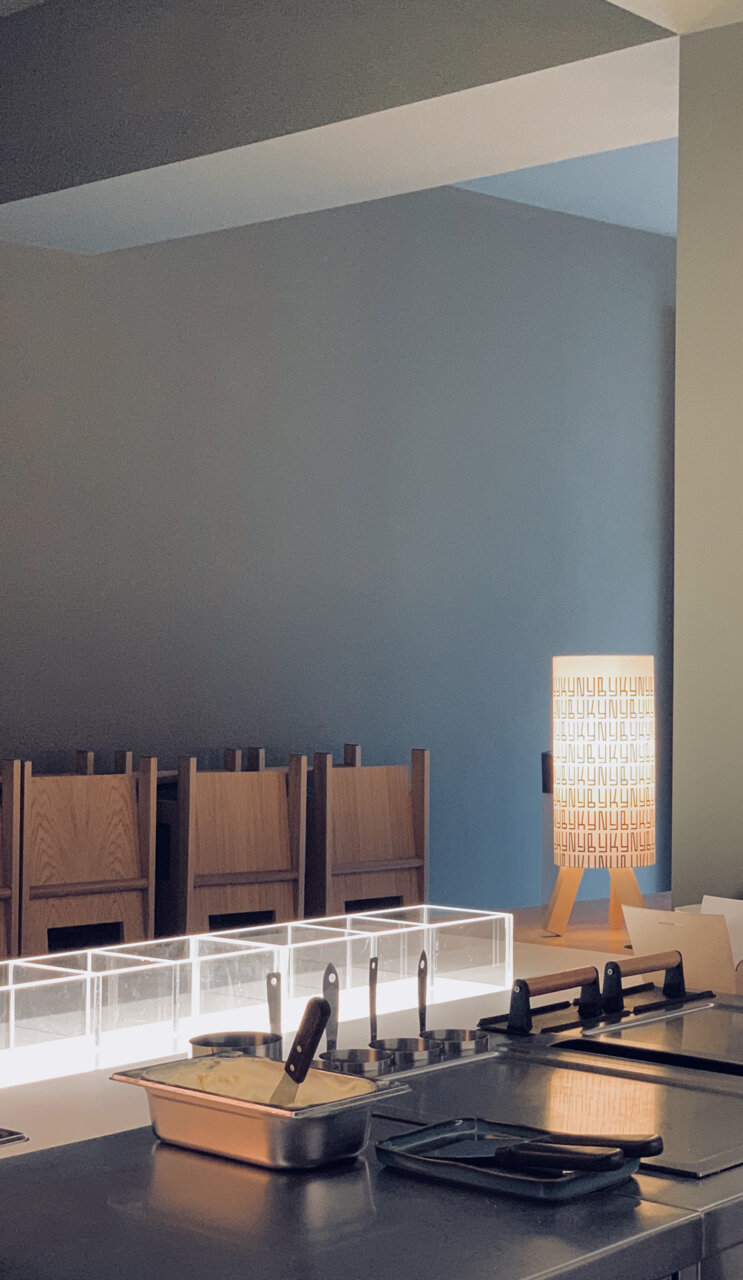
The Lamps
The idea of using the graphic image as a printed fabric was also applied in part to the sing, and to the lamps inside.
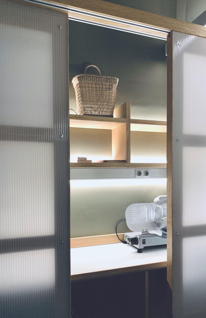
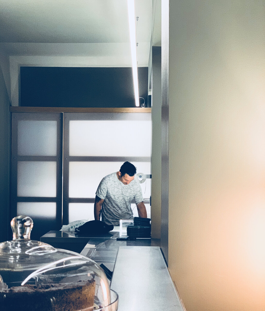
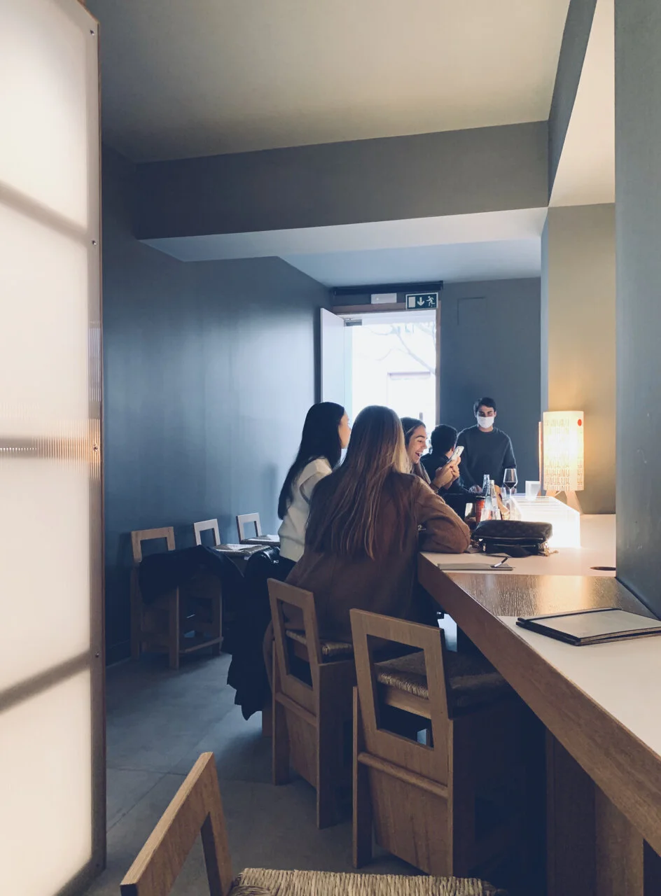
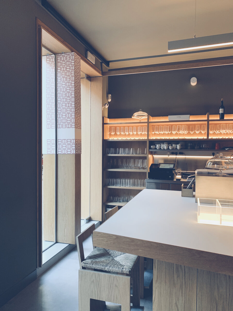
The Panels
Another resources used, to counteract the feeling of reduced space, was to put light panels around some walls, in the form of sliding doors to cover internal staff uses.